
Mental health is as important as physical health because they are deeply interconnected. Over time, poor mental health can contribute to or exacerbate physical conditions like heart disease, stroke, and other health issues. However, it can be difficult to prioritize and support our well-being for a variety of reasons. With work, family, friends, school, and other life priorities.
Saya is a mental health app designed to provide people with accessible resources to support their well-being. Initially, I explored how journaling could play a role in improving mental health. While journaling is widely recognized as beneficial, the users I interviewed—along with my own experience—showed that many did not naturally gravitate toward it. This led me to explore other ways an app could effectively support mental health, focusing on simplicity, ease of use, and access to reputable resources.
Many existing mental health apps heavily emphasize self-reflection through journaling. However, my research revealed that while journaling can be helpful, it isn’t a universally engaging or effective method for everyone. I wanted to explore alternative ways a digital tool could positively impact mental well-being—particularly by reducing barriers to mental health support. My goal was to design an intuitive, welcoming platform where users could quickly find guidance, information, and tools that fit their needs.
How can saya set itself apart from other mental wellness apps?
By analyzing similar apps, I learned that overall they were simple, user-friendly, and offered daily check-ins for the user. However, there were varying degrees of pricing and features behind a paywall, along with different levels of mental health information.
I wanted to create an accessible, educational mental health resource where users can easily discover the tools they need to feel like their best self.
I conducted 5 interviews with potential users who care about their mental health, along with conducting an anonymous survey to 13 respondents. I wanted to gain a better understanding of the how and why behind what users do, particularly looking into:
1) What kinds of self-care practices do they engage in?
2) How do they choose which self-care tools to use?
3) What are their pain points with taking care of their mental health?
To better understand how young people engage with their mental health, I conducted a survey and user interviews focusing on two key questions:
1) How do users prioritize their mental well-being?
2) What self-care methods do they already use—and which feel most effective to them?

For my survey, I wanted to discover how people took care of their mental health, their views mental health apps, and any motivations or barriers they face in their self-care.
The majority of survey respondents engaged in hobbies and talked to their friends/family for support for their regular self-care. Nearly half of respondents engaged in self-care activities several days a week, and noted that it was very important for them to prioritize mental well-being in their daily life.
The majority of respondents have used a mental health app before, with their most helpful features/tools being:
- Breathing exercises/stress management
- Tracking progress and goal setting
- Access to professional support, mood tracking and insights
Majority of respondents agreed that enjoyment from hobbies motivated them the most to engage in self-care. Half of respondents agreed that fostering personal growth and self-improvement was important to them.
The top 3 challenges/barriers for respondents to regularly maintain their self-care routines were:
- Lack of motivation
- Feeling overwhelmed
- Time constraints
Conducting this survey was a very helpful first step in understanding the users I'm designing for. With this quantitative data, I also wanted to gather qualitative data through analyzing my user interview results.
I grouped similar interview responses together in order to find themes and trends. Categories/themes I found included “self-care”, “routine and progress”, “challenges and barriers”, etc.
The main user pain points for taking care of mental health were:
- Time management
- Feeling overwhelmed, tired, distracted, unmotivated
- Financial barrier
While the main user motivations for taking care of mental health were:
- Engaging in community
- Having fun (hobbies)
- Introspection (therapy, meditation, breathing)
- Physical benefits (sleep, exercise, hygiene, beauty)
- Seeing progress and self-improvement
By mapping these themes and summarizing the survey results, I found that time management and feeling overwhelmed are major barriers to mental health care. Users stay motivated by engaging in communities, enjoying hobbies, and seeing progress in their self-improvement. Focusing on small, achievable goals and fostering a sense of support can greatly improve their mental health routines.
I synthesized the findings into an affinity map, which revealed several key insights:
1) Users wanted mental health tools that fit seamlessly into their daily lives. Many struggled with consistency and preferred low-effort, structured support rather than open-ended reflection.
2) Journaling was not a widely adopted habit. While some users found value in it, most did not naturally gravitate toward writing as a form of self-care.
3) Self-care often included quick, accessible activities like listening to music, exercising, or engaging with a supportive online community. Many users wished mental health apps felt as effortless as scrolling social media.
To ensure Saya’s approach aligned with evidence-based strategies, I referenced mental health professional websites and research-backed resources. This helped guide content curation and ensure the app provided reliable, supportive information without overwhelming users.
After gathering my research results, I was set on creating an app that provides users with simple, flexible tools to fit their mental health routines into their busy lives and help them stay consistent.
Features of saya:
- Free with optional premium features (view trends over time)
- Access to external support (mental health hotlines, therapy resources)
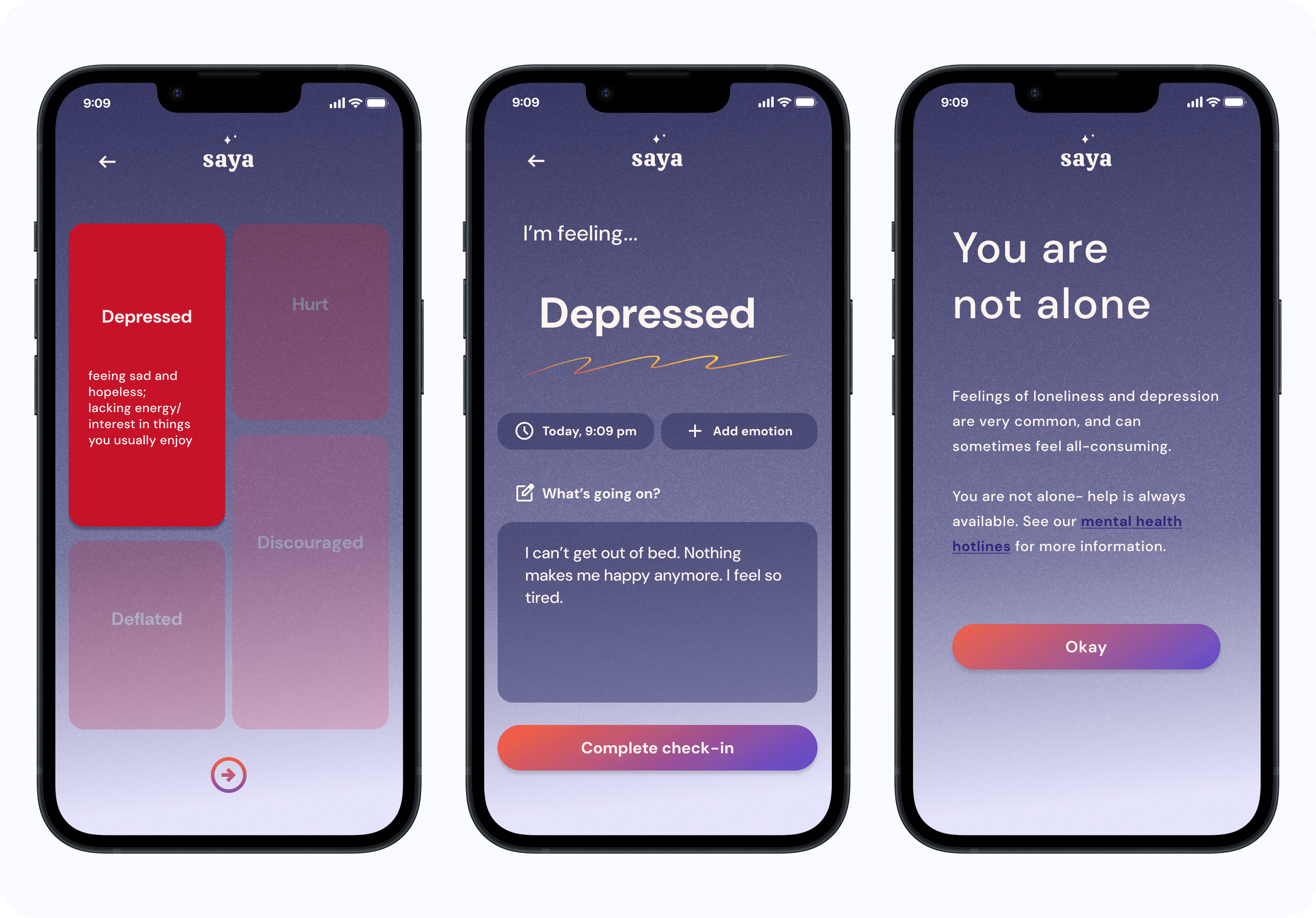
- Daily emotion check-ins
- Quick, digestible solutions (time management tips, managing stress, practicing gratitude, etc)
After synthesizing my findings and creating user personas, I brainstormed different features and started to structure the app.
I wanted to prioritize having a simple and straightforward layout. The main features of the app are 1) user identifying their emotions and 2) having mental health tools and resources readily available. All features are accessible, with an optional premium feature that shows the user's emotion trends over time and gives them personalized guidance.

Now it was finally time to start designing! I began with brainstorming a few different brand values for saya, which were: calm, trust, gratitude, and curiosity.
From these brand values, I assembled my mood board. I was drawn to a textural pastel look, warm/happy colors like yellow/orange, and cool colors like indigo for contrast.
I sketched many different versions to arrive to saya's final logo design. Saya's name comes from the word masaya, meaning "happy" in Tagalog. I wanted the logo to reflect the feeling of happiness.
I chose an orange/yellow gradient using colors from my color palette and used a circle motif; I liked the soft edges with circles, and the yellow/orange circle reminded me of sunshine. I chose this serif font for the logo because it felt both friendly and professional-- it has rounded letters without feeling young.
I took the inspiration from my mood board and began creating the elements for my UI kit: saya’s logo, color palette, fonts, icons, buttons and components.
For my color palette, I was heavily inspired by the colors in my mood board: purples, pinks, oranges, and yellows (also ensuring it’s AAA-approved for accessibility).
As a mental health app, I wanted the overall design to feel relaxing and approachable, while also feeling professional and trustworthy. I continued this branding with a soft sans-serif font, simple illustrations, and rounded edges throughout the design.

I sketched out my initial low fidelity key screens before digitizing them. I was inspired by some minimalist mental health apps I saw during the competitive analysis phase. With feedback from my mentor, I narrowed down my ideas and moved forward in creating more specific mid-fidelity wireframes.
As I created the mid-fidelity wireframes, I referenced both my site map and user flows in ensure a logical flow to the app. I focused on creating a clear structure before adding in the colors, illustrations and icons.

I referenced my mid-fidelity wireframes and UI kit to start building my high fidelity wireframes. I focused on creating the key screens of: landing page, sign up/sign in, onboarding, homepage, feelings check-in, tools screens, trends page, and mental health hotlines page. Once the wireframes were complete, I linked the screens together to create the prototype.
I interviewed 5 users for my usability testing, along with receiving additional comments from my mentor. The overall consensus was there’s a strong brand identity that reads well with the app’s theme and purpose.
I got an incredible amount of helpful feedback from this process. I specifically received comments about building out more screens for the tools and check-in flows, and some minor suggestions like adding a check-in time to the homepage or adjusting the boxes to have a more symmetrical composition.
Utilizing this feedback, I updated and finalized my high fidelity prototypes-- previewed below!


I’m most proud of just persevering through and finishing this project. I am very passionate about mental health and advocating for people getting the help they need— however, it was difficult and honestly felt a little hypocritical to create a mental health app when I was struggling with my own. This process took a lot longer than I initially anticipated, and at times I felt a bit lost with how to proceed. I am so grateful for the amount of help and support I’ve received from my friends, family and my mentor. I am very happy with the outcome of this app, and I hope that it is helpful for users just like me.
If I had more time to expand on this project, I would have added even more features and details to the app. I would:
- Build out the therapy resources page with recommendations for sliding scale therapy
- Add a tool screen talking about the importance of sleep with mental health
- Add a favorites/bookmark feature for users
- Spend more time improving and building out the trends page
The next steps for this project would be looking into and considering more of the business and financial goals, i.e., the revenue model, retention rate, potential partners and sponsorships.


